 I'm continuing with my studies in AECP today. I spent the day working on the Easy Blending Techniques taught by Amy Lee. I love her style, it's bright, cheerful and whimsical! I was excited to see what she was going to show us.
Ink blending is one of the first things I would teach after basic stamping back in the day. Its great for making coordinating cardstock to any project. I always used a large sponge which I cut down to a manageable size. Nowadays they have all kinds of tools to use for blending. I still have all the old school stuff, but I have managed to pick up some daubers and a square blending block as well. The latter I was never impressed with as I felt it always left lines on my papers. Until now! With Amy's techniques I didn't have a single line created while blending! The trick is to blot off some of the ink before you put it to paper...its seems obvious now....
I actually made 5 different projects, but I'm only going to share 2 here. I used Altenew's Best Mom set for both of them and while the set and the colors are the same, the cards are very different.
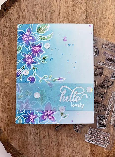
This first one was so fun to make! After stamping and embossing the flower branch with embossing powder, I ombre'd the background using the inks from the Cool Summer Night collection. I started with the lightest color Sea Glass on the right then worked my way to the left darkening the colors as I went. Having the darker color over the stamped image really made them pop!
I then used a technique Amy showed us. Since Altenew's crisp inks are water soluble, I added water to the shapes and added more color to them loosely to give it a watercolor feel. I added Frayed Leaf, Forest Green, Lavender Fields, Deep Iris and Midnight Violet. It was fun to add the colors and a little went a LONG way!
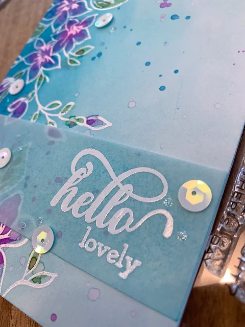
I then lightly splattered the background with some of the ink colors and water. I finished it off by adding a sentiment from Fancy Greetings on vellum paper with white embossing. To make the panel stand out, I blended Ocean Waves on the back of the vellum just to give it a little something to stand out. I added some embellies and it's finished!
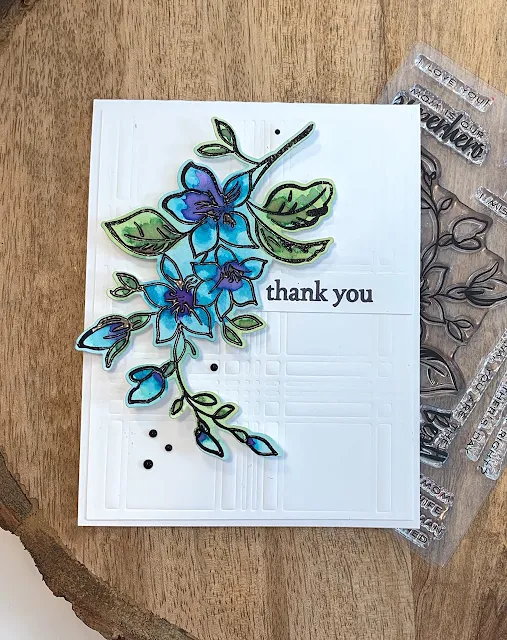
The second card is is much more simple. I stamped and embossed in black the image from the set, die cut it and using daubers added color to it. I used Frayed Leaf, Sea Glass and some Ocean Waves over the different parts of the die cut. I then used the same technique and added color and water to the shapes in the image. I used the same colors; Ocean Waves, Lavender Fields, Deep Iris, Midnight Violet and Forest Green and added just the tiniest bits of color to the image with water. I like how it came out especially with the black embossing for the image!
I finished off the card with a dry embossed background using the Layered Plaid die, and added a sentiment from the Wonderful Wycinanki stamp set. I completed its look with some enamel accents in black.
If you think blending is an antiquated technique, think again! I found this class to be challenging and it allowed me to rethink it. I really think I'll be using this technique more in my creations!
Have a colorful day!


2 comments:
WOW!!! Both the cards are GORGEOUS!!! I absolutely love the colour palette. I love blues and purples together, they make everything look good! Your layout and style looks amazing.
Thank you for entering your fabulous work to the AECP assignment gallery. Super work!
Lovely cards!
Post a Comment