Sunday, September 22, 2019

MFS Clean and Simple

Hi y'all!

Super quick post here.  I have created a card for the MFS Card Design Superstar challenge.  This time I did the Clean and Simple Genius approach.

Even thought this is an interactive card....it's a shaker in case you couldn't tell, the design is simple with an elevated craftsmanship.  The background is dry embossed with the cursive 'You' die from the MFS You Trio die set.  The repetitive embossing is a subtle but effective for a patterned background that adds to the overall effect of the card.  Also, keeping the design simple allows the extra elements to really shine!

The shaker part of the card, was created by layering 6 pieces of 110lb card stock with the same die cut.  Using foam wasn't working, and the heavy cardstock works perfectly for such a small amount of space.

The sentiment was completed with a fishtail tag from the All About You stamp set.  It was embossed with white powder on a pink piece of cardstock to pick up the color in the plaid.  Finally, a few sequins were added to add more sparkle!

Hope you enjoy!

Have a colorful day!!


Thursday, September 19, 2019

Hardest. Card. EVER!!

Hi y'all!


Well...I have just completed my first interactive card that wasn't a shaker card.  It was HARD!!!  Kudos to all those artists out there that can make these suckers in their sleep.  I struggled, and cursed, and re-did every aspect at least TWICE....if not more....while working on this creation.  I'm tellin' ya, it was a labor of love and determination!  AND....I'm obsessed with it!!!  It's so darn cute and, after all that hard work, the interactive part actually works!!  Thank you to My Favorite Things for the 2019 Card Design Super Star challenge, it REALLY pushed me outside of my comfort zone.  I've made this card for the 'Innovation Master' category.

Being a novice at interactive cards, I did some research on what to create.  I searched and searched.  I wanted to do something different....because I apparently like to torture myself....and most of what I found I had seen before.  I pulled out my MFS stamps to encourage my inspiration.  Then I spotted it.  The London Mouse set.  It has been retired, but it's still one of my favorites.  I LOVE the taxi and double decker bus in the set, I used one on this little ditty not to long ago.  This set reminds me of a trip we took London 2 years ago.  That's when it hit me...I wanted to make the cars look like they were driving by!  Perfect!

I looked for instructions online to make the turning panel, but couldn't find anything.  I'm sure there is one out there, but for the life of  me, I couldn't find one.  I decided I needed to engineer one and started with straws, lots and lots and LOTS of foam and tape, packing tape, acetate and 2 food picks.  Epic fail.  After many....many, many....attempts, it didn't work.  The images were too large for my vision to make the risky turn around....they have a terrible turning radius....however the little mice were the perfect size.  I set to try and make that work.  With a little experimentation and pulling out my almost dead laminator I was FINALLY able to make the mechanism work.  Here it is as I was engineering it.
 Yup, that's a Popsicle stick in there...


And this was my work space when I was only 1/2 done with it and about 4 hours in.

Yup.  It's a disaster, and that's just my desk area!  I didn't take any photos of my cutting or die cut area because it was just too terrible to behold....I've spared you all the horror!.....  BUT....I got my vision to work!  Here is the adorable little creation in action....
EEKK!!!  I know, right?!?  Too adorable!  I showed it to my hubby when I was done because I was so proud of myself.  He thought it was cool but I should have made it automated.  I almost killed him.  He's on life support now.

Here are close-ups of all the scenes it created.


 These are the rain clouds and rain, 'cause it rains a lot there.

Here it is with the cutie patootie mouse...


Tuesday, September 17, 2019

Last one!

Hi y'all!

I've done it!  Completed my final class for the Level 1 AECP.  This program so far has not only been fun, but it helped me re-visit some techniques I hadn't done in a long time, and to use them in a new way.   I highly recommend checking them out!

The final class, Irresistible Inking Techniques is a great re-fresher!  I used all four techniques on the cards I created. 

The first cards, I made together using a piece of acetate to create the ombre background.  I LOVE how they came out!  I need to remember to use this technique more often.  I used the Tea Party and Sweet Dreams with color ink sets and Bamboo ink.


The leaves from the Altenew Leaf Canopy set were stamped and embossed with gold, then die cut.  Using the same colors from the background, I used the inks as water color paints.  The embossing helps to keep the puddles of water in their respective leaves which made the painting even easier.  I originally was going to use the contrasting leaves on the backgrounds, but at the last minute decided to go monochromatic.  I'm glad I did!  Having the contrast was just too much and fought each other. 


I splattered the background with the darkest color from the background and some gold shimmer water color paint. The sentiment was die cut with the Altenew Fancy Hello die with gold mirror paper.  Everything was completed with a few sequins for some shimmer!  I'm entering these cards in the Global Design Project challenge for this week, Bloom and Grow; and the Simon Says Stamp challenge Monochrome.


The second card I used the direct to paper technique for the background.  Using the color inks from the Warm Grey color ink set.  I rubbed the pads in straight lines to give the illusion of wood planking.  I continued the process with the 3 lightest colors. 

I felt the background was lacking, so I used my Broken Chevron stencil to complete the wood background by inking the stencil and placing on the inked background.  I finished off the card with a painted die cut from the Leaf Cluster set and wood branches from the Create a Wreath die set.

The sentiment is stamped around the edges of the card, with the 'you are' beginning each of the statements.

The final card uses the direct to paper technique.  The Mega Happy sentiment is die cut from a white cardstock panel.  The remainder was then dry embossed with the Layered Snowflakes Die B.

The sentiment was then subbed with a Versamark ink pad, and embossed with gold powder.  It was then rubbed with a Pink Pearl ink pad.  Its a great technique if you want a specific color of paper.  I repeated the process with the 'birthday' sentiment as will using the Coral Bliss ink pad. 

The card was finished off with a little stardust glitter glue on the sentiment and some sequin embellies.

Well, that's it!  I now am waiting for my assignment for my 'final'...Can't wait to see what it is!

Have a colorful day!

Monday, September 16, 2019

Die cutting fun

Hi y'all,

I'm here with my 9th class in the AECP program.  The class is called Easy Die Cutting Techniques, taught by Yana Smakula.  The class teaches different, outside of the box ways to use your dies.


During my recovery from surgery, I've been binge watching a tv show on Netflix that is set in the 70's.  I've been kind of obsessed with the imagery, bold lines, and funky color combos.  So fun!  My creations for this class has obviously been influenced by this show.


I recently received my new Altenew Fine Frames dies, both circle and rectangle dies.  I loved the thin circles these dies make.  They are versatile and perfect to use with for my 70's inspiration this week.  This first card uses the circle die.  Each of the colors die cut created a whole SLEW of circle pieces.  I've saved all the pieces I didn't use for this card for future projects.

 Loving how these die cuts stack up!  The white panel was cut with the die so the fine frames would fit recessed inside, this keeps the card to a single layer.  The panel was then attached to another piece of card stock to create a base for the die cuts to adhere to.  Each die cut circle was attached separately into the frame in concentric circles in an ombre effect based on value instead of color.

After completing the circle frames, the sentiment is then die cut from the panel and gold mirror paper using letters from the Inline Alpha Set.  The gold mirror letters were then added into the negative pieces on the front panel to give the sentiment some shine!  All of this and it's essentially a one layer card despite all the die cuts!....well, and the 'you're amazing' strip but does that really count?.....  This card is being submitted to the CAS on Friday challenge this week.  It's perfectly CAS and it needed a die cut sentiment, PERFECT!!


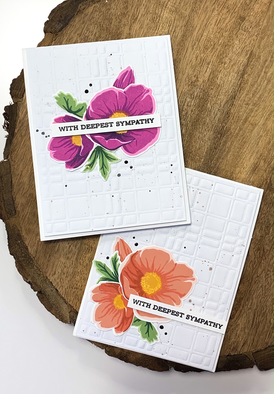
The second card was created using the scraps from the first card.  Again, using the circles gave this card a very graphic image.  The circles were layered off center and the layers were overlapped creating a funky grid.  This card is also being submitted to the Just Us Girls Challenge this week!  Actually, all the cards could be submitted with all the layering, but this one has the dies stacked onto each other, for their Stacked Die Challenge.

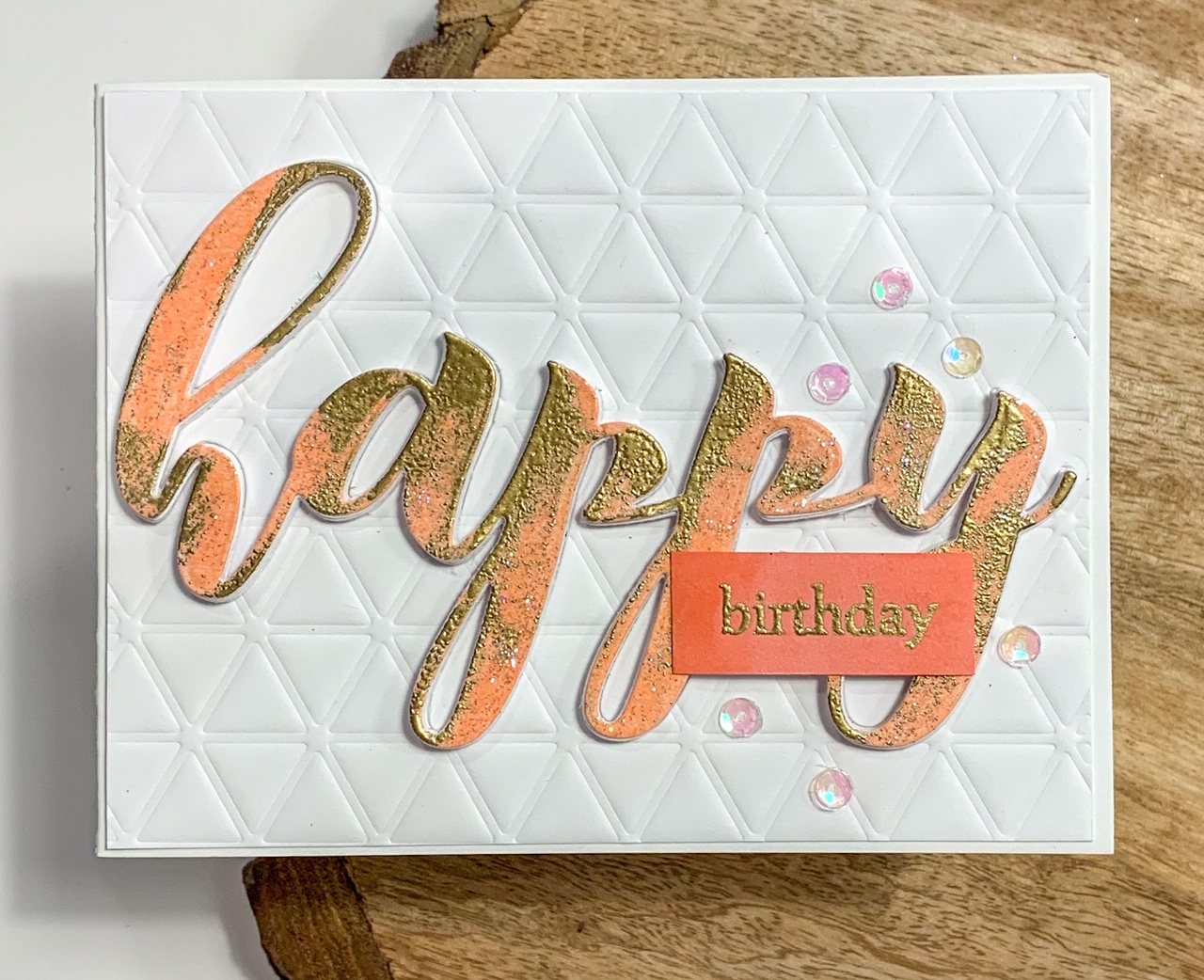
This card needed a sentiment that was bold and fun, thus the 'You rock!' from Altenew Label Love and the Bold Alphabet Dies were used.  Seven layers of the dies were cut and stacked and placed in the negative space of the die to make the word literally pop of the card!  The stamped image was cropped down and adhered with some foam tape.

The card was finished off with some white enamel dots and some old peach pearls found in the embellies stash, it matched perfectly!

ernests : PhotoThis final card was inspired by this funky image.  The play of color with the orange vs. the purple is shocking and has great interest.  A bit of green was added to complete the die cuts which gave it more of a rainbow effect, not what was intended, but its still a fun card!  This card was also completed at 10 pm.  When taking the photos today, I realized I didn't crop the stamped sentiment!  I tried to peel it off, but alas, it tore the paper.  I decided to include it anyway as I liked the design.  I'm adding this to the Paper Players challenge this week, use Metallics!

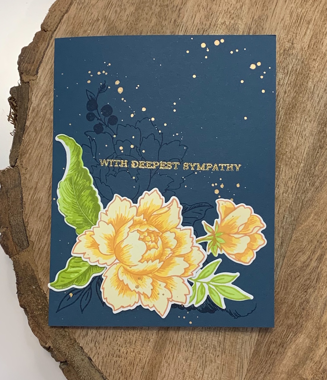
The front panel was cut with the rectangle Fine Frames die at a diagonal.  A piece of Press N' Seal wrap was added to the back so the corner pieces would stay in place to make the layering of the dies easier.  After all the frame pieces were attached, the panel was run through the die cutter so it would have good adhesion to the wrap.

The sentiment was then die cut into fun foam and the assembled panel to give the front dimension and the gold letters were set back into the recessed space.  The sentiment from Label Love was added in the orange.

Off to complete my last class for Level 1!

Have a colorful day!


Sunday, September 15, 2019

A hard week

Hi y'all,

I'm so glad this week is over!  It has been hard.  We had 3 deaths touch our lives this week.  Watching our loved ones grieve is difficult.  It truly makes you grateful for all the blessings in our lives.

With these announcements, I realized I didn't have a single bereavement card in my stash of completed cards.  I created a few more cards to use this week and more for my stash.  I really put my Mist to work while creating these!  The Altenew layered floral stamps are perfect for multiple card making.

This first card I made 2 of.  I used my Misti which made it a simple way to create them.  I stamped out multiples of the flowers from Altenew's Peony Bouquet with leaves all at the same time. 

For the background, I stamped the outline images to create movement across the card.  I finished it off with the sentiment and some splatters of gold watercolor paints.

The second set of cards I again used my Misti  I used the new Altenew Hellebore stamp set. 
I really like this stamp set.  The image is very bold and graphic!  I repeated stamping with my Misti so I could whip these out quickly. 

The background was done by dry embossing with the Layered Plaid dye, it makes a great background for simple cards.  I also splattered the background with gold and black watercolor paint.  I finished it off with enamel dots in black.

The final card I made I used the Beautiful Peony stamp set.  The back ground I painted with my new Altenew watercolor brush markers  The colors are SO intense!  I have to learn how to use them, but they are fun to use so far.

After I made washes of grey, blue and dusk, I then added a wash of gold watercolor paints.  I love the shimmer of the gold.

I finished the card off with the flower images, masked and embosssed with black embossing powder on vellum paper.  Its super artsy, and perfect for my cousin and his wife. 

It was good therapy for this weeks events.  I'm glad I have this outlet.

Have a colorful week!

Monday, September 9, 2019

They like me!

Holy cow!
I was voted a winner with Altenew's August Inspiration Challenge!  I'm so excited!!  All these classes are paying off!

BUT... I've got to get a camera...I noticed how terrible my photo looked compared to the others!  I guess the iPhone 7+ isn't as good as I thought....

Scene Stress

Hi y'all!

I'm on my 8th AECP class today, I'm just cruzin' right through them!  Until today that is....  I actually watched all the sessions over a week ago.  It's just taken me this long to figure out what to do!

Nichol Magouirk taught this class, and let me tell you her Copic skills are AMAZING!!  I bow to her mastery...  This class is Seasonal Scene Building.  I have to admit, this is not something I normally do while I create.  I don't have a ton of 'scene' building stamps and literally none from Altenew.  I had to get creative and think outside the box to make this assignment work.

This first card, I'm not really sure it meets the parameters of the assignment.  You see, I was to create a scene using stamps using masking techniques.  Check out this beauty here that Nichol made...
Altenew_MaskingAScene1
Created by Nichol Magouirk
See what I mean?  And just one layer!  I don't have anything resembling that in my stash.  So....outside of the box I went.  Far outside the box....like Siberia far....  Hemmin' and hawin' over this assignment for a week, I finally thought I would make a garden trellis with the Altenew Grid stencil and the Leaf Clusters stamp set.

So, not as creative as Nichol's beautiful creation.  I do like how it looks like the leaves are behind the trellis for a far off garden in the background.
 I added some little embellies of sequins and enamel dots since it looked so plain.

The second card I made is a shaker card, I haven't made one of those in a bazillion years!  To say I was rusty was an understatement, but I mustered thru.

The background was created by using ink blending die cuts from Altenew's Wreath Builder as stencils to create my scene.

I added some of those die cuts to the front to give it a feeling of tree decorations.  I also added an ornament from Brilliant Baubles.

I love this color combo for Christmas, traditional red and green are not my thing.  I've used these colors to create for years like this Paper Crafts Stampin Royalty card and this Paper Crafts blog hop creation.  What are your favorite holiday color combos?

I'll be eager to hear if this meets the parameters of this assignment!!!

Have a colorful day!