Wednesday, October 30, 2019

Super quick!

It's a quick post tonight.  I was subbing today at school and had a busy afternoon.  I completed my creation and wanted to post it before I head to watch Expedition Unknown....my guilty pleasure!...

Watercolored peony!  Practice is definitely making it better!  The colors were inspired by this weeks Global Design Project challenge.


Thanks everyone, have a colorful night!


Tuesday, October 29, 2019

Its getting better?

Put your feet up and relax, I'm sure it's been a busy day.

I took a step back from the complex image from yesterday and decided to tackle the Beautiful Peony stamp set.  It is a fussy image, but I thought if I embossed the image, it would be easier to watercolor?

I was right!  I decided to emboss it with copper bling embossing powder, just to make it a little 'extra'.  I used my Japanese watercolors for these....and since I don't know Japanese, I can't tell you the name of the colors....it has a large variety of reds and oranges to use.  Painting with the embossing powder is so much easier!  The raised embossed areas keep the water where it needs to stay and you can just tap the color into the place.  Easy peezey!  I didn't emboss the leaves so they were harder to create, and the ink moved a bit when I painted them.

I decided the card needed a minty green paper background with ink blended with Volcano Lake on the lower left corner of the paper and added splatters when I was done.  A piece from the Fine Frames Cover Die cut from white card stock was added to bring the eyes to the focal point.

To bring in more copper, the sentiment is die cut from a shimmer yardstick left over from my wedding 5 years ago....I never throw anything away.....  It added the perfect amount of shimmer!

I'll be teaching all day tomorrow, so I'm hopeful I can get my creating in.

Have a colorful day!!


Monday, October 28, 2019

H2O Color Challenge

Welcome back, thanks for stopping by!

Last weeks self-inflicted challenge (SIC) was so fun!  I really enjoyed taking time for myself every day to support my addition creative side.  I'm continuing the challenge this week, but instead of focusing on a single stamp set, this week I will be working with watercolors.

Watercolor class in college was the bane of my existence.  It is something I've NEVER been really been good at, unless it's just an abstract ameba type creation.  I think that's why I like making papers and using them to die cut from or use the free form amebas as backgrounds.  That's easy.  No focal point to perfect, just free painting all over the paper.  Because actually making a watercolor painting, not so good for me.  The paints end up grainy, or I use too much paint, or too much water, AND then the creation doesn't look at all what I had planned!  UGGH!....I think I may have a mild control problem....

However....I love, love, LOVE, the beautiful watercolor flowers I have been seeing everywhere!  That's what drew me to Altenew when I came back to paper crafting this year.  There are many beautiful and delicious sets to watercolor....I'm obsessed with their stamps, which doesn't help with my addiction....  I have tried to do some, but have hated each and everyone I've made.  Hence, my theme for this week.  I will master this technique!!!....or it will kill me, either way should be entertaining content for you....

I decided to pull out Altenew's new stamp set Grateful Heart.  Erum Tasneem on the Altenew team makes the MOST BEAUTIFUL watercolor flowers, they just make my heart sing!  I thought I'd tackle it with this stamp set.

 Perhaps I should have watched more of Erum's lovely videos?  Perhaps I should have chosen a simple image? I definitely should not have selected a lovely parrot tulip, with all it's variegation, stripes and texture....they are one of my favorite flowers....for my first foray into the H2O world.  The other 'should'?  I SHOULD have realized it WAS a parrot tulip when I STARTED and not until AFTER I had finished my painting....my 20+ years of florist-ing completely failed me....  Seriously, how did I not see it?  I mean, the leaves TOTALLY read tulip!!  *sigh*

I ended up using too much paint, not enough water, too much control and the image is pasty instead of clear and transparent.  *sigh*.  Anyhow, I am putting this baby out there.  It's not horrible, I mean, it does read flower.  The lovely orange color with the touch of lime green was inspired by the JUGS photo challenge this week.  I don't have any pumpkin/fall stamps and my Sunflower Daisy stamp set is still smoking from all its work last week!


The results thus far:

Watercolor - 1
Kristin - 0

Stay tuned to see if I make it out of this week alive....

Have a water-colorful day!


Sunday, October 27, 2019

Here it is!

The last post of my challenge week!  I'm so glad I have decided to make this time for myself.  It has really be a joy creating all week, which make me a happy mom and wife!

For this final card, I had a peach daisy I had made when I created that jig earlier in the week.  I decided to create with my favorite colors, navy, green, coral and yellow.

The navy blue background is stamped with the leaf images from the Sunflower Daisy stamp set.  The panel is then splattered with metallic gold watercolor paint....I love that stuff!.... and a strip of gold wash tape from Altenew helps to add interest to the background.

The daisy images and leaves are assembled together before placing it on the back panel.

Finally, the sentiment is die cut from a piece of ink blended coral paper....the ink, not the paper....  To add more gold, its layered on another die cut from mirror gold paper.

That's it!  My first week of challenges is complete!  I've decided to change up my challenge a bit by either using a stamp single set for a week or technique.  Next week.....watercoloring!


Graduation and a new program

I't so great to see you here!  Thanks for stopping by...

I was very excited to have graduated from Level 1 of the AECP program!  That last project was HUGE and took me forever to get completed.  I'm now onto my next level of the program.  The first class is Beyond Basic Backgrounds taught by Lydia Evans.  This post is FILLED with techniques, so I thought I'd enter them all in the Just Add Ink challenge this week, 'add a technique'!  Kind of apropos...

This first card focuses on perfect spacing with a repeating background.  I created a card with this technique right here in the last level.  With this one, I decided to challenge myself with different shapes that need to fit like a puzzle.  The Follow Your Arrow set is perfect for this!

The background is first ink blended with a rainbow of colors!

Next, using a MISTI, lay out the arrows in a square formation with even spacing between each arrow.  Stamping with Versafine Black ink, rotate your paper in the MISTI and stamp until the entire paper is covered.

Stamp and heat emboss the sentiment in white on black paper, then repeat the processes with the long arrow in black on white paper.  Using the inks from the background and a watercolor brush, color in the arrow to match the background.  Color in edges around the arrow with a black artist marker. 

This next card uses Water Bleaching for the background.  Now, I don't have any Distress inks....I know, shocker!....and water didn't work with my Altenew inks very well.  I decided to try spraying rubbing alcohol on my stamps then stamp.  It worked perfectly!  BUT....

Use the rubbing alcohol sparingly, as it's not really good for your stamps.  Again, the background was created by ink blending ink with Lagoon, Volcano Lake and Just Green.  The stamp is placed in the MISTI, as you need to stamp twice to make the effect happen.

Finally, the sentiment is stamped and die cut.  Add a few splatters and some simple sequins for some interest!  The layout for this card was inspired by this week's layout from Freshly Made Sketches.  It's a great place to get ideas if your stuck for a layout.


Lastly, this creation is QUITE the color explosion!  Using freezer paper and the Snowflakes Layered Cover dies from Altenew and their 36 Watercolor Pan set, each space is colored with a color of the rainbow.....sorry the photo is terrible!....

Once the panel is dry, the Mega happy die is used to cut out the sentiment from the decorated panel and 5 white pieces of card stock.  Then glitter glue in various colors is added to make it just that much more 'extra'.

This isn't a card I would give just anyone, but this is perfect for my littlest one.  She is my crafty extra girl!....just like her mama....

It's my least favorite of the 3, but I LOVE the technique and know I'll be using it often.

Alright!  Have a very colorful day!


Saturday, October 26, 2019

Soft support

I have discovered I don't tend to make sympathy cards unless I need them.  It's just not something I gravitate toward I guess.

I found a challenge last week with this color story and I thought I'd try it.  The colors are so soft and pretty, a change from the bright colors I've been using all week.  I kept with the grey to work this card into the CASology challenge this week, FOG and the Watercolor Wednesday Challenge All About Occasions


 The daisy was created using Soft Lilac and Lavender Fields.  The first layer was with Soft Lilac stamped off and stamped 3 times.  The second layer using the same ink without stamping off.  The third layer was stamped with Lavender Fields then the 4th was double stamped to increase the depth of the color.

The background was stamped on grey card stock using the Gentleman's Grey ink set.  Just a little hint of leaves to carry the eye across the card but not distract from the daisy image.  The added thread was a first for me.  I like the tiny amount if interest it added.

The card was finished with white and black water color splattered paint and a sentiment from Sentiment Strips and a couple of sequins.

I hope you have a colorful weekend!

Friday, October 25, 2019

Craftin' away!

I've been so busy baking for our holiday cookie party and crafting in the studio, I almost forgot to post my creation for the day!

 I know...it's like vintage wallpaper.  It's just so bright and pretty IRL, and SUPER easy to re-create!
I started by using my 'rub off' yellow ink panel....it's how I clean my blend brushes....and added a bit more ink in the corners.  Then, using the Altenew 36 Watercolor Pan set, I splattered some Warm Sunshine paint across it as well as some clean water splatters.

The daisy is incredibly bright using the Altenew Red Cosmos ink set, and with the green leave using the Green Valley inks...it's awesome!  It reminds me Dorothy Draper fabric, like this one...
 Oh, how I SWOON over this fabric!!  I sooo love it...  Anyhoo.  I kept the layout simple so the daisies would shine.

Stamping the solid leave images from the set in the yellow for the background, helps to tie everything together and also ground the daisy, so it doesn't look like it's just floating there in space!   The sentiment was added in the center of the layout to keep it from looking like an after thought sticking it in the corner or something.  Finally a few sequins.....I'm sure Dorothy would approve.....

Thanks for stopping by today!  Have a colorful weekend, and I'll hopefully see you tomorrow!


Thursday, October 24, 2019

My favorite so far...

I'm continuing with my challenge, and I have to admit I LOVE this card!  I was inspired by my AECP For the Guys class, where Jen Razza used Warhol to inspire masculine cards.  You can see my original post for the class here where I used the same inspiration with bow ties.  When I began to play with the colors for this flower, I thought of that class and our Warhol inspiration!

Used my Misti to create a jig.  it took some trial and error.  I had my card stock cut at a local Office Max and the card panels were NOT straight....I won't say which one....Airport Hwy Toledo.....  So disappointing since the Neenah paper is not cheap.  Lots of trial and error but I was able to crank out about 10 great daisies!  These 4 were my favorites out of the lot.  I'll be using the others for another project.  You can check out the video on how I created the jig below.

When creating the color combos, you will still want to use the varying values of the colors.  In other words, your base stamp will be the lightest color, the second stamp the second lightest and so forth.  For example, the first daisy....which is my favorite!....started off with Altenew's Sunkissed ink for the first image, Orange Cream for the second, then I moved over to Deep Iris ink and Midnight Violet for the final color.  Unexpected color combos are a great way to spice up your stamp usage!

Keeping the layout and the sentiment simple, allows for the daisy image to really shine! With that in mind, I'm entering this card in the Addicted to Stamps Challenge this week, Clean and Simple!


What kind of color combos can you come up with?

Have a colorful day!

Wednesday, October 23, 2019

Computer fail and user error

Good evening!

I just realized my post from yesterday didn’t go live when I scheduled it to do so....I’m uber bummed....  I DID have my post and my creating time yesterday, so good for me.  Unfortunately my laptop died last week and I’ve been using my iPad to create my posts.  The Apple version of Blogger looks a bit different than the Windows version and I must have forgotten to do something I would have done normally on my computer.  I SHALL SOLIDER ON!!!....and get a new laptop asap....

In the meantime, here is my creation for today!

It is very hard to see the embossed wood panel background but its there.  It adds a soft and subtle nod to a farmhouse style.  The oval also has the embossed wood panel texture to it as well.
The colors of this creation could lend itself to a Spring or Fall greeting.  The purples and mustard yellow are very versatile the with brown, kraft and muted green colors.  
This is definitely a 3D card.  There are loads of foam stickers behind the scenes to hold it together in just the right places.

I thought I'd enter this cutie at The Flower Challenge....I mean I am using a flower stamp set all week, it would be silly not to enter them!

Have a colorful day!

Tuesday, October 22, 2019

Bright and simple

Welcome!  I’m so glad to have you here!  It’s the second day of my personal challenge.  Yesterday, I used the Sunflower Daisy set with an ink blended background.  Today, I’m using the same set to create a simple card with a die cut background and bright vibrant colors!

The Altenew inks are made to coordinate with each other in their color groups, but its also fun to mix them up with each other in the same image.  The Daisy in this image was treated with Rose Quartz and Puffy Heart from the Rose Petal collection and Heart Beat and Vineyard Berry from the Tea Party collection.  Mixing the color groups adds a bit of depth and variety to the stamped image.  It is easy to do with this stamp set, as the image has 4 stamps.  You can use the full range of values in different colors to make interesting combinations.  The leaves for this image were created using Mountain Mist, Volcano Lake and Just Green.  The layering of those colors is just as fun as can be!  It’s a great complement to the daisy image.


The Altenew cover dies, are so versatile.  This card is bright with color and simple in it’s layout.  The die cut panel is Altenew’s Circle Quilt cover die, cut out of vellum.  A vellum die cut is a great way to add a little extra texture to your background without distracting from your main image.

A strip of orange cardstock with the sentiment stamped on it with Firebrick highlights the daisy center perfectly.  Completing the card with iridescent sequins adds a touch of color.

I'm entering this in the Sunday Stamps Challenge and The Flower Challenge!


Great seeing you here, have a colorful day!


Monday, October 21, 2019

A new challenge...

Good morning to you!  I know your life is probably filled with all kinds of projects and responsibilities, so I’m glad you’re taking time out of your busy schedule to visit me.

Like you, I’m a crazy busy person!  With 2 kids, hubby, dog, work, volunteer work, party planning (3 coming up in 6 weeks) and maintaining our household, my time is limited.  With all that going on, I have also come to appreciate the need for ‘me’ time.  It just makes me a better mom, and I like being the best mom I can be!

SO...I have decided give myself permission to have a little ‘me’ time each day to create.  I know myself well enough, that if i’ts not set as a priority and I don’t have someone to be accountable to it, I will easily give up MY time to take care of others.  With that knowledge, I’ve given myself a challenge to stick to; Create each day, using the same stamp set during the week.  I chose that as my theme, as I tend to gravitate to the same tried and true sets in my library, leaving others to gather dust and not see the light of day!  I hope challenging myself will keep my creating juices moving AND in being accountable to you, it gives myself permission to shirk my ‘duties’ for a short time!


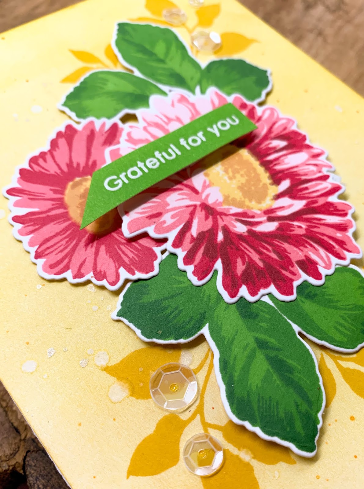
I decided to start off this challenge using Altenew’s Sunflower Daisy stamp/die/mask set.  I’ve had this set since May and have only really used it twice!  I love sunflowers which drew me to this set.  Having been a florist in a former life, you should know the image is perfect to use for either a sunflower or a Gerbera daisy....hence the name I suppose....  I use a Misti when using this set, as I can make multiple flowers by setting up a jig and cranking them out in any color combination I can think of!

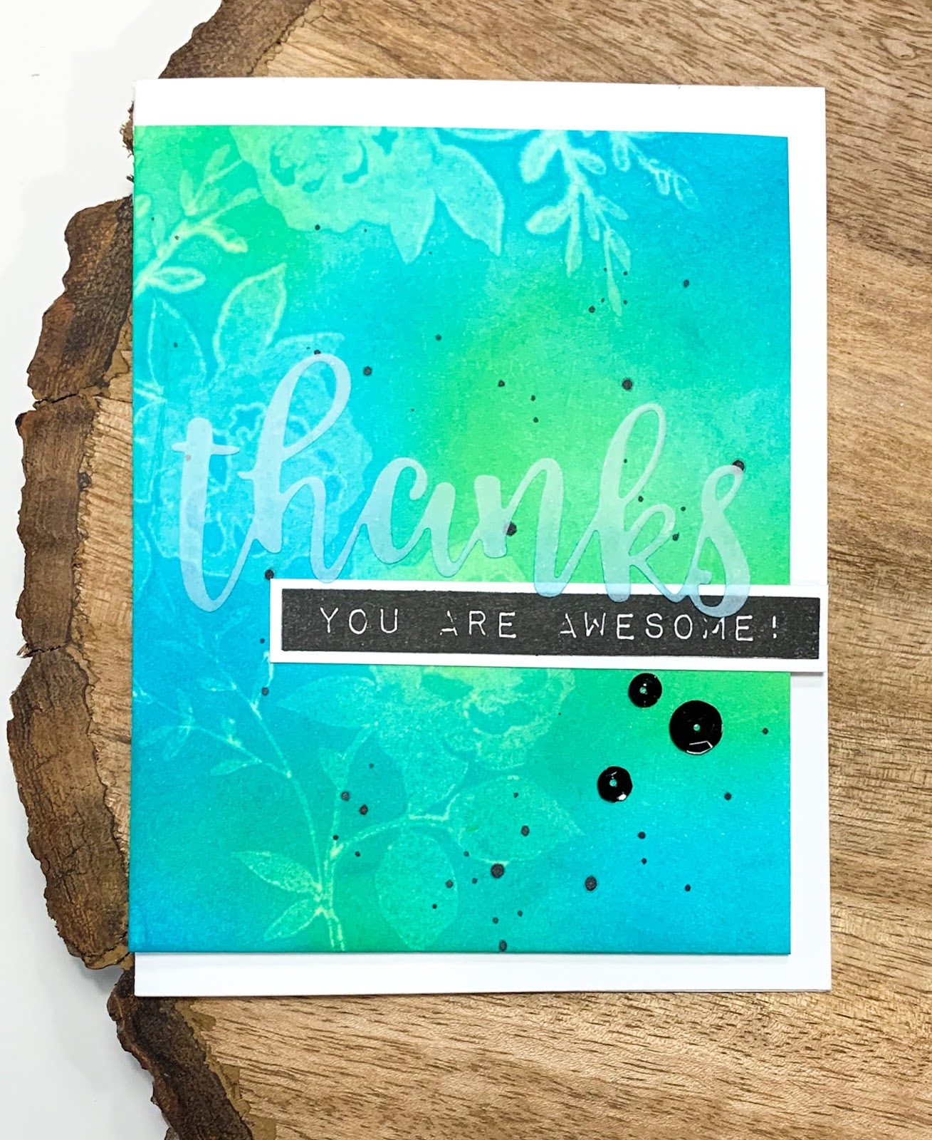
This card was incredibly simple to create.  The background panel is one I had in my back-up stash.  I made it organically over the course of a few weeks.  I have a habit of cleaning my blending brushes on a clean piece of cardstock based on color.  This panel used a combination of the colors from the Sweet Dreams and Sea Shore ink sets from Altenew, I used them both recently when I created this card set earlier this month.  Each time I would use inks with my blending tool, I rub them On the clean cardstock until no more ink comes off.  It creates a lovely variegated background with tons of depth!....I can’t let that ink go to waste!....  When I feel the piece of cardstock is lovely and full of color....which usually takes a few cards....I will stick it in my stash for future use!...its quite convenient....  Then paint splatters were added using Teal Cave ink with a watercolor brush and a little black watercolor to add some interest and stamped the solid non-layered leaf images in Grass Field and Shadow Creek to ground the main image.

Next, the sunflower image is stamped out using the Warm and Cosy ink set from Altenew.  The color is intense in person!  To bring your eyes to the center of the card, several die cuts from Fine Frame Rectangle set were used and placed in a random pattern.  The 3 frames were then adhered using spray adhesive and run through my die cutter so they adhere well the the panel.

The sunflower image was then added in the corner and the sentiment from Fancy Words was added in Versfine black ink.  Finally, who doesn’t like a little bling?  Iridescent sequins were added instead of clear to add a subtle variation of color.

I hope you’ll continue to join me this week as I showcase and challenge myself to use the Sunflower Daisy set.

Thanks for being here and have a colorful day!