Friday, September 6, 2019

Stencil Techniques

Hi y'all!

I am here today to show you some really fun stencil techniques!  I am continuing my journey with the AECP today.  The class I just finished was Celebration: Stencil Techniques.  I have recently developed a strong affection for mixed media papers.  I love using stencils while making these, first they're affordable; second, they're versatile, and lastly, they're just fun!

I've created 2 cards for this class, and my Very.  First. Video!....YIKES!!!....  But lets get started on how to create these cards.
This first card, uses the Altenew On the Plus Side stencil to create the background.  First the stencil is laid down on Cool Caribbean card stock and inked it with Altenew Sea Glass ink.  It was simple....aka not extra....and needed something a little more.  Then, using a translucent matte medium, the stencil is shifted over and the medium is spread over the stencil.  Quickly removing the stencil after, it is sprinkled with a super fine glitter with lots of shimmer and sat aside until it dried.
I LOVE how it came out!  The shimmer is so lovely.  I mean, photos don't do it justice....
With such a beautiful background panel, it needed to be finished off simply, using the flower and leaves that were inked up while creating the second card.  More on that in a bit.  Next, a sentiment from the Wonderful Wycinicki was heat embossed with white on black paper, then assembled all together and mounted onto a black card base to compliment the sentiment strip.
My second card, I stenciled the ba-geezses out of it!
It started by stenciling the background using the Buffalo Plaid Builder stencil by Altenew using a sponge for ink blending with Sea Glass ink.  After completing the blending, the stencil is flipped it over so it would create a herringbone pattern. The process is repeated in the opposite direction using Frayed Leaf ink.  This created a lattice/gingham type pattern.  Due to the nature of the stencil, it leaves a small white stripe, which was covered with a simple thin strip of white paper.  It looks like a room at the Greenbriar Resort!  So soft and pretty.
Wanting to keep the foreground with the flowers as soft as the background, I decided to try stenciling them.  I actually used the Garden Pick 3D flower die set for this.  I thought it would be too difficult to explain the process, so below is the video explaining how I was able to create them.

The card is finished off by using a chipboard frame I've had in my stash for ever!  It was inked up with Versamark and heat embossed with white powder.  The flower and the leaves....using the same process as the flowers....were then assembled over the frame and a sentiment strip on vellum was created with the One Friend stamp set using white embossing powder.   The back of the strip was inked with Sea Glass ink to make the sentiment pop!
Ok!  On to my next class!

Have a colorful day!


Shimmer and Shine!


Hi y'all!

I've been in resting mode this week, recovering from a little surgery.  I haven't been in the art studio all week and it was fun to be there for a few hours this morning!


I have 2 new cards I created for the AECP class Let It Shine.....remember you can take this class too!  hit the link.... This class is TOTALLY up my alley!  I love to add glitter and shine to anything I can.  I'm just 'extra' that way....at least that's what my teenage daughter calls me....  My first card has MEGAWATT shimmer and shine to it!  The second is more subtle...

I started off with my favorite background die from Altenew, Layered Plaid.  This is such a versatile die for backgrounds.  I find myself grabbing it often.  This time, I decided to create a background with a monochromatic scheme, but with some glitter paper.

I first die cut a piece of plain card stock with the die.  Before I removed the paper from the die, I firmly pressed Press and Seal Glad Wrap paper to the back of the paper still in the die....following me so far?....  After I had the wrap well adhered to the back of the die cut paper, I then carefully lifted the metal die off the front of the paper.  What should be left for you is the entire die attached to the wrap paper, negative and positive pieces....some may fall off, just set them aside to add later....  I then carefully peeled off the positive part of the die cut and set aside the wrap with the negative pieces still attached.  I repeated the process with the glitter card stock.  I then swapped the positive pieces with each other and ended up with this fabulous background paper!!  I just trimmed the wrap paper edges off with my trimmer, but its still under there, holding it all together.

Next, I got to creating those fabulous flowers from the Fantasy Floral 3D Die set.  I water colored 2 pieces of Bristol paper, one in a contrasting color to my background, the other in green for the leaves.  I assembled the flowers, but added some gold embossing powder to the final layer for some extra shine.....'cause I'm extra.....


I finished off the card with a die cut sentiment that I added some glitter glue to since the plain white seemed so lacking.  Don't you think?


This second card, had me cursing for a while today.   Backstory, I have a laminator I was given 7 years ago that was probably already 15+ yrs old when I got it from a printing company.  It's been in storage for 5 years.  This was the first time it's seen the light of day since going into storage.
Fast-forward to today....


I've never used foil on a card before, but after Jennifer Rzasa's and Carissa Wiley's tutoring, I thought I'd give it a try.  Using my 22+ yr old, hasn't been used in 5 years...laminator.  AND....it didn't work.  First, the paper got stuck.  Then it was too hot and the image smooshed.  Then, it was still too hot.  Then, the foil wouldn't stick.  So, I scrapped the foil.  I think I need to use a laminator that isn't professional grade and perhaps invest in a new one.  I WILL conquer this!!!

BUT,until them.... I have these fabulous little place cards with gold foil around the edge I thought I would add to this card and then used more of the fun gold mirror paper I have on hand.


I continued with the Layered Plaid die for the background, but just as a dry embossed panel.  Using the Garden Picks 3D die set, I created these flowers using vellum.  I cut them out, and added ink to the backs of the first 2 layers, I left the 3rd layer clear and the 4th layer is done with the gold mirror paper.  The leaves are water colored and I added splatters of the green, pink and some gold shimmer watercolor paint to the background panel.

And then I was on to my next class.....

Have a colorful day!

Saturday, August 31, 2019

Almost forgot!

I almost forgot to post this creation I made for the Altenew Inspiration challenge and Addicted to CAS challenge!  That's surprising considering the roses took FOREVER to make.

I did like how the roses turned out.  Very fun and bright!  I will need to practice more with this die set, I really like how they turn out.


I die cut each section of the Altenew’s Garden Picks 3D, then painted them with the crisp dies used as watercolor paint.  The colors are so bright and vibrant!  I love it!  The leaves are due cut from vellum paper and the veins are embossed with gold powder. 

  I dry embossed the background with the Layers Plaid die A.  I really love that simple addition without distracting from your focal point.

I finished the card off with a tag stamped with a sentiment from Fancy Greetings in gold embossing and gold splatters in the background with gold watercolor paint.

As I'm posting this, I'm sitting and enjoying a campfire...perfect weather for it!

Have a colorful weekend!

My Guy

Hi y'all!

I'm just cruzin' along these AECP classes!  I must admit I created a stampin' widower this week....he's been so patient with  me....  My beloved hubby truly is the best!  He allowed me to build an AWESOME art studio....which I'm sure he's regretting right about now....where I've been spending a ton of time in this week!

The class I just took for AECP was For the Guys by Jennifer Rzasa.  I don't have boys, so my masculine stamping stock is minimal....other than patterned papers....  I had to think long and hard on how to use what I had to make masculine cards for my hubby.  Now I historically have made cards for him that are cheeky....pun intended....like this one, or have some sort of gnome reference....we have an affection for gnomes....like this one and this one

The class did give me some good ideas for cards.  So many in fact, while I thought I would just make 1 card,  I ended up making 3! 

 First, as an art major, I have a love for anything referencing a master artist.  Jennifer had a great idea for an Andy Warhol card and since I LOVE color I had to do one!

Obviously, when you look at this card, you don't think 'guy card' but my hubby is one rare bird!  I mean, just look at his fabulous fashion sense.  He is NOT afraid of color!  See what I mean on why this is a perfect card for him?

I used a free set I received from Altenew called Thanks Dad....and thanks Altenew!....  I loved the bow tie image and immediately thought of this stamp when Warhol came up!  I didn't add a sentiment, so I could use it for any occasion and possibly stick it in a frame for his desk.  And yes, it would match my color-lovin' house!

I added Altenew's Layered Plaid die B to each of the color panels in the background.  I realize it's busier than a Warhol, but it just called for a little something extra.

This second card I again used theAltenew Layered Plaid dies, both A & B.  I used masculine colors, but this card could easily be made in any color combination for man, woman or beast! 

I used the Wonderful Wycinanki for the damask motif.  I heat embossed it with 2 layers, silver and pearl silver.  It's a subtle difference and I like that.  It keeps it looking simple with such a fussy background.

Finally....this is my FAVORITE one for him!  It makes me giggle! 

I tried to think of different ways of using the Altenew stamps I own.  This was actually my second concept I created....but I had to save the best for last....  These stamps are from the Wonderful Wycinanki set!  They are supposed to be leaves, but I've made them into little flames for this card.  Aren't they adorable!?!

Using my handy Misti tool, I was able to make sure all the flames lined up perfectly and easily.  The orange and yellow stamping were done by hand.  I don't own any Altenew letter stamps or dies....yet....so I had to pull out a REALLY old Stampin' Up! one that I kept for a rainy day....It's not raining, but it is cloudy and that worked for me....  If I were to do it again, I would die cut the 'hot' part of the sentiment so as to keep the pattern from being broken up.

I'm going to spend tomorrow with my beloved and eldest daughter, so I won't be creating.  Well, maybe when they go to bed I'll sneak away....

Have a colorful day!


Friday, August 30, 2019

Ink blending 101

Hi y'all!

I'm continuing with my studies in AECP today.  I spent the day working on the Easy Blending Techniques taught by Amy Lee.  I love her style, it's bright, cheerful and whimsical!  I was excited to see what she was going to show us.

Ink blending is one of the first things I would teach after basic stamping back in the day.  Its great for making coordinating cardstock to any project. I always used a large sponge which I cut down to a manageable size.  Nowadays they have all kinds of tools to use for blending.  I still have all the old school stuff, but I have managed to pick up some daubers and a square blending block as well.  The latter I was never impressed with as I felt it always left lines on my papers.  Until now!  With Amy's techniques I didn't have a single line created while blending!  The trick is to blot off some of the ink before you put it to paper...its seems obvious now....

I actually made 5 different projects, but I'm only going to share 2 here.  I used Altenew's Best Mom set for both of them and while the set and the colors are the same, the cards are very different.

This first one was so fun to make!  After stamping and embossing the flower branch with embossing powder, I ombre'd the background using the inks from the Cool Summer Night collection.  I started with the lightest color Sea Glass on the right then worked my way to the left darkening the colors as I went.  Having the darker color over the stamped image really made them pop!


I then used a technique Amy showed us.  Since Altenew's crisp inks are water soluble, I added water to the shapes and added more color to them loosely to give it a watercolor feel.  I added  Frayed Leaf, Forest Green, Lavender Fields, Deep Iris and Midnight Violet.  It was fun to add the colors and a little went a LONG way!

I then lightly splattered the background with some of the ink colors and water.  I finished it off by adding a sentiment from Fancy Greetings on vellum paper with white embossing.  To make the panel stand out, I blended Ocean Waves on the back of the vellum just to give it a little something to stand out.  I added some embellies and it's finished!

The second card is is much more simple.  I stamped and embossed in black the image from the set, die cut it and using daubers added color to it.  I used Frayed Leaf, Sea Glass and some Ocean Waves over the different parts of the die cut.  I then used the same technique and added color and water to the shapes in the image.  I used the same colors; Ocean Waves, Lavender Fields, Deep Iris, Midnight Violet and Forest Green and added just the tiniest bits of color to the image with water.  I like how it came out especially with the black embossing for the image!

I finished off the card with a dry embossed background using the Layered Plaid die, and added a sentiment from the Wonderful Wycinanki stamp set.  I completed its look with some enamel accents in black.

If you think blending is an antiquated technique, think again!  I found this class to be challenging and it allowed me to rethink it.  I really think I'll be using this technique more in my creations!

Have a colorful day!

Thursday, August 29, 2019

One layer wonder

Here's a creation I made for my application for AECP.  I wanted to create a 1 layer card that looked like it had dimension.  I love this stamp set from Altenew, Sunflower Daisy.  Its intimidating, but once you try it out, I think you'll love it as much as I do!

The flower is a great image, it takes 7 stamps to complete it, but I only did 6.  I didn't use the base stamp because I wanted my daisy to look white with pink accents. 

I stamped the leaves and added some watercolor shading to the background to make it pop off the card.  Finally I added the sentiment and the cute embellies at the end!  I'm entering this cutie at the Addicted to CAS blog this week!

A new class

Its a gorgeous day in Ohio!  I have the day off so I'm spending my time in the art studio.  I have completed another class for the AECP program called Clean and Simple Boutique Cards, taught by none other than Jennifer Rzasa.  You don't have to be a part of the AECP to take the class, and I highly recommend if you struggle with CAS cards like me.


Clean and Simple is not my normal forte'.  I tend to be fussy and over complicated with my work.  Always trying to do something a 'little extra'....my daughters call me 'Extra', it's my thing....  I knew this class would be a challenge for me!  I have 3 projects I completed from this class, each showcasing a different lesson.

I started off the class by making this simple, 1 layer card.  I think I made this card at LEAST 6 times....I would change the color, the layout, the ink would bleed through the washi tape, then it would bleed through 2 layers of washi tape....it was the bane of my existence!   I will say I do like how it came out after all the trial and error.

I used Altenew's Leaf Clusters stamp set for my images and my sentiment.  I used 3 layers of washi tape....just to be sure NOTHING was getting through it....so I would have a blank space for my sentiment.  Then using my Misti, I stamped the background layer twice with Frayed Leaf ink.  I like the intensity and the full coverage of the inks when they are stamped twice, they look luscious!  The forefront leaves were stamped in Forest Green ink, again I double stamped these as well.  I then used my ink pads to make a watercolor wash to splatter those 2 inks on the background.  It's an old trick I use often for water coloring and Jennifer also shows you how to do it in her class....go check it out!....

I removed the washi tape and stamped the sentiment.  I kept the layout all to the left, I like the juxtaposition of all the images on one side with lots of white on the other.  It's just a different way of balancing the space.

After I stamped the sentiment, I added the black lines with a Sharpie marker and a ruler....'cause it's what I got!....  I then highlighted the leaves by hand lining them with a .03 Micro marker.  In the end, I think it's a nice card.  SUPER simple 1 layer card for me!  So I'm entering it in the Addicted to CAS blog this week!


This second card I focused on using a single stamp to create a background.  I thought about using a floral stamp and even started with one, but decided to do a sentiment instead from Altenew Fancy Greetings....because I can't just keep it simple....  I used this sentiment for my daughter.  She is in the process of trying out for the play in school and is struggling with her confidence.  She loves when I give her cards....she still has the one from her first day of 1st grade I put in her lunch box, she's in 10th grade now....and I love making them for her!

First, it's NOT at all what I had planned, but I LOVE how this came out!  It's teenager grunge and I like it!  Like the first card, I probably made this background 4 times before I liked it.  I started off by stamping the sentiment just above center.  This is an old technique I learned in art school when I learned to frame my work.  If the focal point is exactly smack in the center, it has an uneasy, 'not sure if its really centered' feeling.  If you add a small amount of space to the bottom of your mat when you frame, it gives a better illusion of being centered in the frame.....see, my art degree DOES pays off....  Doesn't it look centered? Anyhoo, I used a black pigment ink then added clear embossing powder to it for some shine and to protect it from the next part of the process.

Next I stamped the sentiment repeatedly to create the background using Versamark ink.  Now, if I had used glossy paper and blended ink on it, the Versamark would have slightly resisted the ink, making it a bit lighter in the background.  Since I'm all out of glossy paper, I decided to try using the Versamark but with watercolors instead.  It didn't resist the paint....at all....and I panicked....after all, that is a lot of plotting and stamping!....  Then as I panicked and wiped away the excess paint with a wipe...a magical thing happened!  The Versamark absorbed the paint more than the paper did!  I then tested my luck and added 3 or 4 light layers of watercolor and repeated the process of wiping it off after a few seconds.  It created this cool watermark background.  I felt like a genius!  I'm sure someone else has done this before, but I'm just so super pleased with myself and will now have to do it again.

I finished it off my highlighting the main sentiment with some extra watercolor paints that I didn't wipe away and some black splatter.  I did use my heat gun to speed the drying process up which helped with the grunge look.

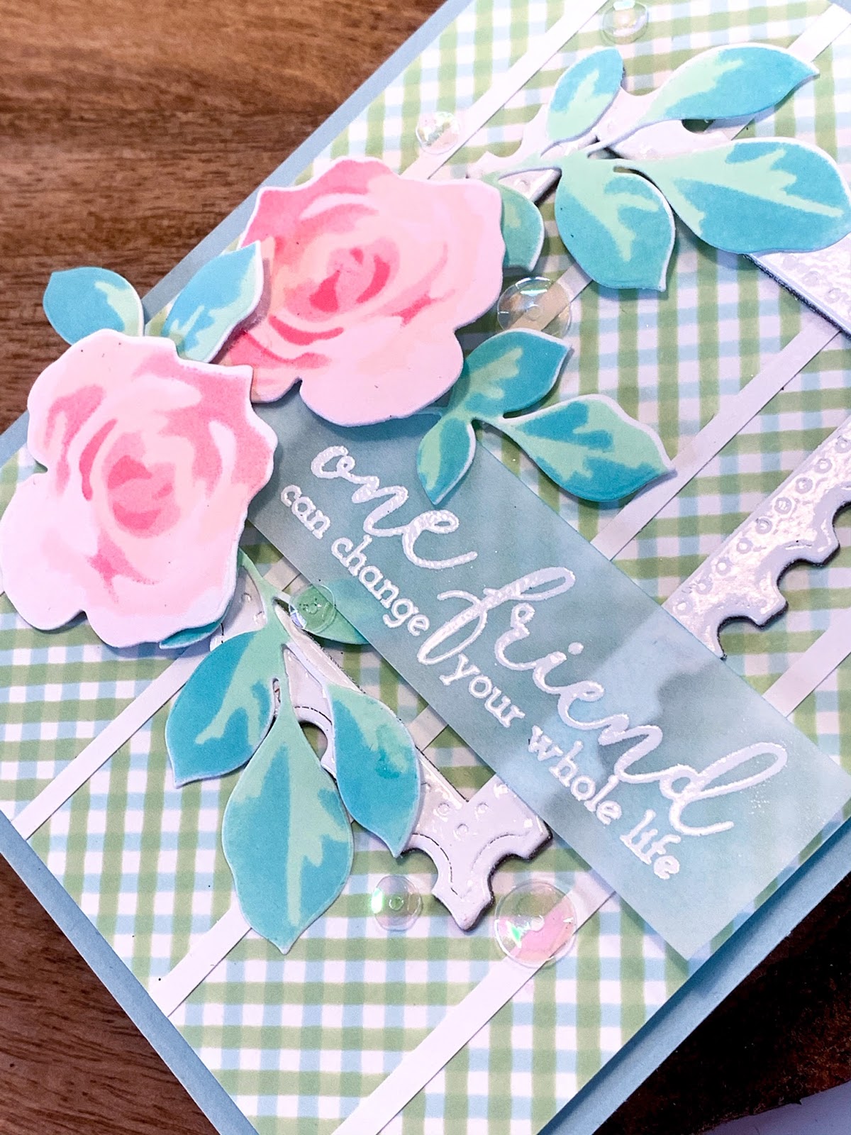
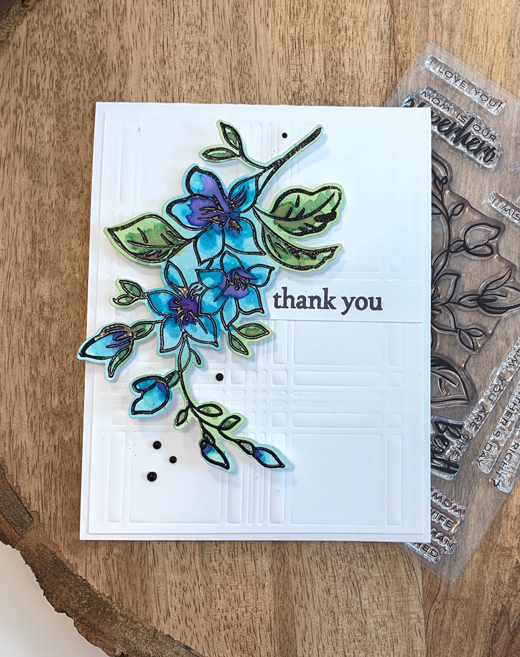
My final project for the class actually combines the last 3 lessons of the class.  I started by creating this card, combining lessons 4 & 5.  I used the Altenew Layered Plaid and Fantasy Floral die sets.  To say this was an easy card in an understatement!

Following Jennifer's advice, I decided to use some luxury papers for my flowers. Since I'm EXTRA, I used all luxury papers for all the layers....yup.... It may have been overkill, but I'm LOVING IT!!! I used 5 different luxury papers; 3 glitter papers, copper shimmer paper and gold mirror paper....the gold mirror paper is awesome on the flowers!..... 

This was my first time using the Fantasy Floral die set, and can I just say, EASEY PEASY!!!  Such a great die set and it make gorgeous flowers!  I couldn't stop making them, it was addicting!  Just look at the shimmer and shine!!

For the back panel, I just ran the Layered Plaid die with a rubber shim to emboss instead of cut the paper....such a great background....I added a sentiment from the Beautiful Day stamp set and assembled them all together.  If I hadn't made a million flowers, it would have only taken me about 10  minutes to make this card.

Then, after I watched Jennifer's last lesson....and with my plethora of flowers on hand....I decided to make a card gift set and some tags to go along with it.  Each card and tag has a different sentiment from Altenew Fancy Greetings and flower color combo.


I finished off the box with a simple stripe of copper glitter to match the cards.  I used  1/4" double stick tape around a plastic box I had on hand.  After removing the paper on the tape, I covered it with the glitter and viola!  Simple and fabulous box!  I tied it off with some ribbon and added one of the tags to it.


That was the longest post EVA!!!  I hope you enjoyed it!

Have a colorful day!!!
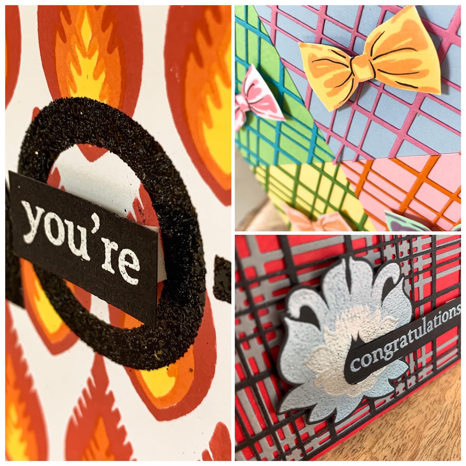
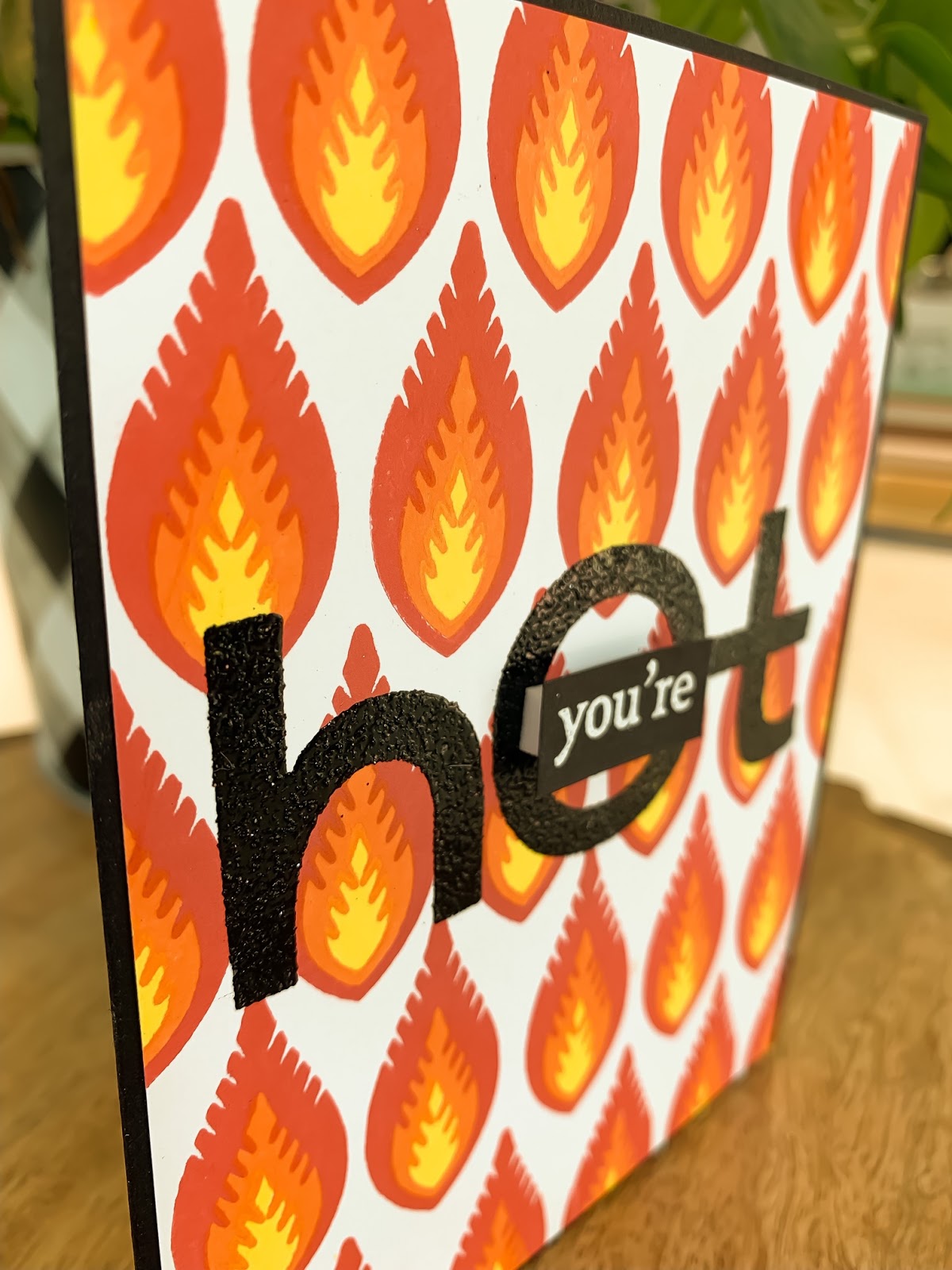