 Its a gorgeous day in Ohio! I have the day off so I'm spending my time in the art studio. I have completed another class for the AECP program called Clean and Simple Boutique Cards, taught by none other than Jennifer Rzasa. You don't have to be a part of the AECP to take the class, and I highly recommend if you struggle with CAS cards like me.
Clean and Simple is not my normal forte'. I tend to be fussy and over complicated with my work. Always trying to do something a 'little extra'....my daughters call me 'Extra', it's my thing.... I knew this class would be a challenge for me! I have 3 projects I completed from this class, each showcasing a different lesson.
I started off the class by making this simple, 1 layer card. I think I made this card at LEAST 6 times....I would change the color, the layout, the ink would bleed through the washi tape, then it would bleed through 2 layers of washi tape....it was the bane of my existence! I will say I do like how it came out after all the trial and error.
I used Altenew's Leaf Clusters stamp set for my images and my sentiment. I used 3 layers of washi tape....just to be sure NOTHING was getting through it....so I would have a blank space for my sentiment. Then using my Misti, I stamped the background layer twice with Frayed Leaf ink. I like the intensity and the full coverage of the inks when they are stamped twice, they look luscious! The forefront leaves were stamped in Forest Green ink, again I double stamped these as well. I then used my ink pads to make a watercolor wash to splatter those 2 inks on the background. It's an old trick I use often for water coloring and Jennifer also shows you how to do it in her class....go check it out!....
I removed the washi tape and stamped the sentiment. I kept the layout all to the left, I like the juxtaposition of all the images on one side with lots of white on the other. It's just a different way of balancing the space.
After I stamped the sentiment, I added the black lines with a Sharpie marker and a ruler....'cause it's what I got!.... I then highlighted the leaves by hand lining them with a .03 Micro marker. In the end, I think it's a nice card. SUPER simple 1 layer card for me! So I'm entering it in the Addicted to CAS blog this week!
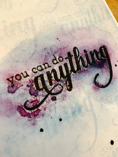
This second card I focused on using a single stamp to create a background. I thought about using a floral stamp and even started with one, but decided to do a sentiment instead from Altenew Fancy Greetings....because I can't just keep it simple.... I used this sentiment for my daughter. She is in the process of trying out for the play in school and is struggling with her confidence. She loves when I give her cards....she still has the one from her first day of 1st grade I put in her lunch box, she's in 10th grade now....and I love making them for her!
First, it's NOT at all what I had planned, but I LOVE how this came out! It's teenager grunge and I like it! Like the first card, I probably made this background 4 times before I liked it. I started off by stamping the sentiment just above center. This is an old technique I learned in art school when I learned to frame my work. If the focal point is exactly smack in the center, it has an uneasy, 'not sure if its really centered' feeling. If you add a small amount of space to the bottom of your mat when you frame, it gives a better illusion of being centered in the frame.....see, my art degree DOES pays off.... Doesn't it look centered? Anyhoo, I used a black pigment ink then added clear embossing powder to it for some shine and to protect it from the next part of the process.
Next I stamped the sentiment repeatedly to create the background using Versamark ink. Now, if I had used glossy paper and blended ink on it, the Versamark would have slightly resisted the ink, making it a bit lighter in the background. Since I'm all out of glossy paper, I decided to try using the Versamark but with watercolors instead. It didn't resist the paint....at all....and I panicked....after all, that is a lot of plotting and stamping!.... Then as I panicked and wiped away the excess paint with a wipe...a magical thing happened! The Versamark absorbed the paint more than the paper did! I then tested my luck and added 3 or 4 light layers of watercolor and repeated the process of wiping it off after a few seconds. It created this cool watermark background. I felt like a genius! I'm sure someone else has done this before, but I'm just so super pleased with myself and will now have to do it again.
I finished it off my highlighting the main sentiment with some extra watercolor paints that I didn't wipe away and some black splatter. I did use my heat gun to speed the drying process up which helped with the grunge look.
My final project for the class actually combines the last 3 lessons of the class. I started by creating this card, combining lessons 4 & 5. I used the Altenew Layered Plaid and Fantasy Floral die sets. To say this was an easy card in an understatement!
Following Jennifer's advice, I decided to use some luxury papers for my flowers. Since I'm EXTRA, I used all luxury papers for all the layers....yup.... It may have been overkill, but I'm LOVING IT!!! I used 5 different luxury papers; 3 glitter papers, copper shimmer paper and gold mirror paper....the gold mirror paper is awesome on the flowers!.....
This was my first time using the Fantasy Floral die set, and can I just say, EASEY PEASY!!! Such a great die set and it make gorgeous flowers! I couldn't stop making them, it was addicting! Just look at the shimmer and shine!!
Then, after I watched Jennifer's last lesson....and with my plethora of flowers on hand....I decided to make a card gift set and some tags to go along with it. Each card and tag has a different sentiment from Altenew Fancy Greetings and flower color combo.
I finished off the box with a simple stripe of copper glitter to match the cards. I used 1/4" double stick tape around a plastic box I had on hand. After removing the paper on the tape, I covered it with the glitter and viola! Simple and fabulous box! I tied it off with some ribbon and added one of the tags to it.
That was the longest post EVA!!! I hope you enjoyed it!
Have a colorful day!!!


